The Brand Foundry
Shai: branding, marketing and commercialisation
Shai is a fictional East African sparkling iced tea in five flavours. The Brand Foundry is the demonstration: how a brand is built, from origin and identity to flavour architecture, campaign and the business behind it.
Fictional creative and commercial demonstration. No real sales or business results.
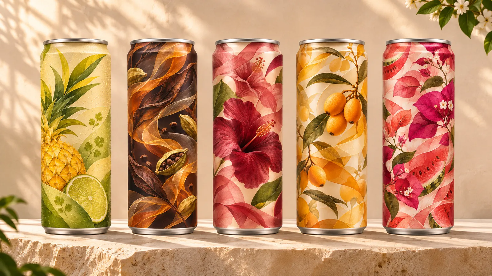
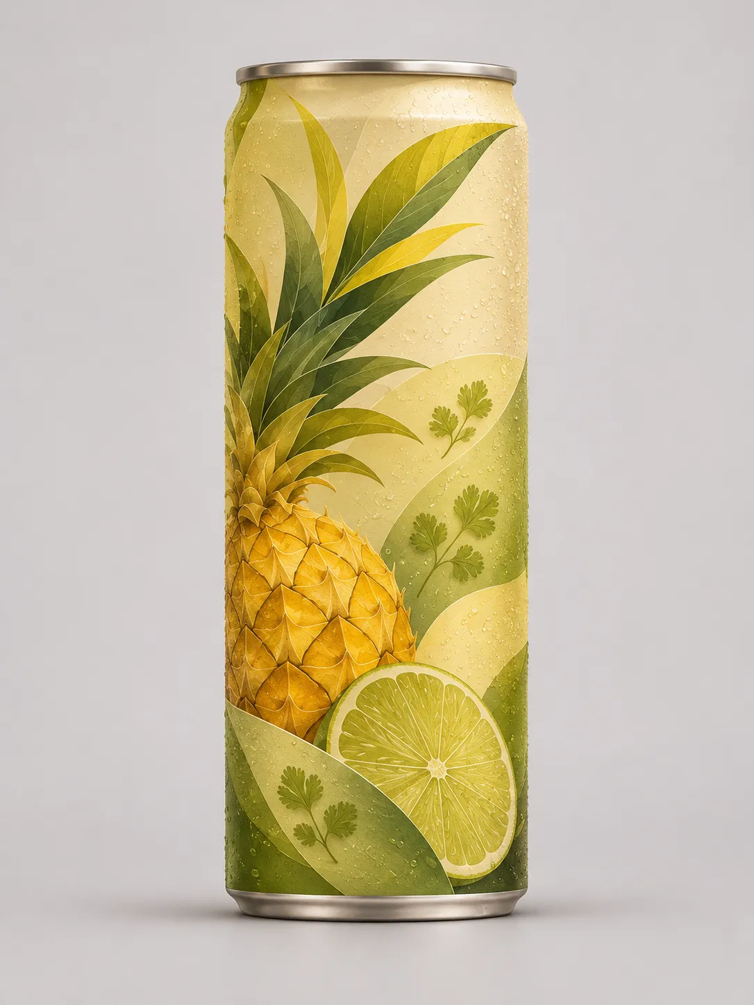
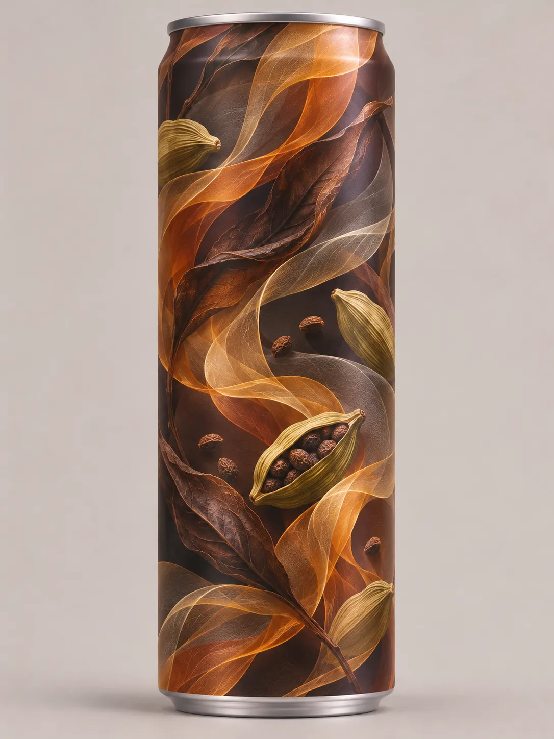
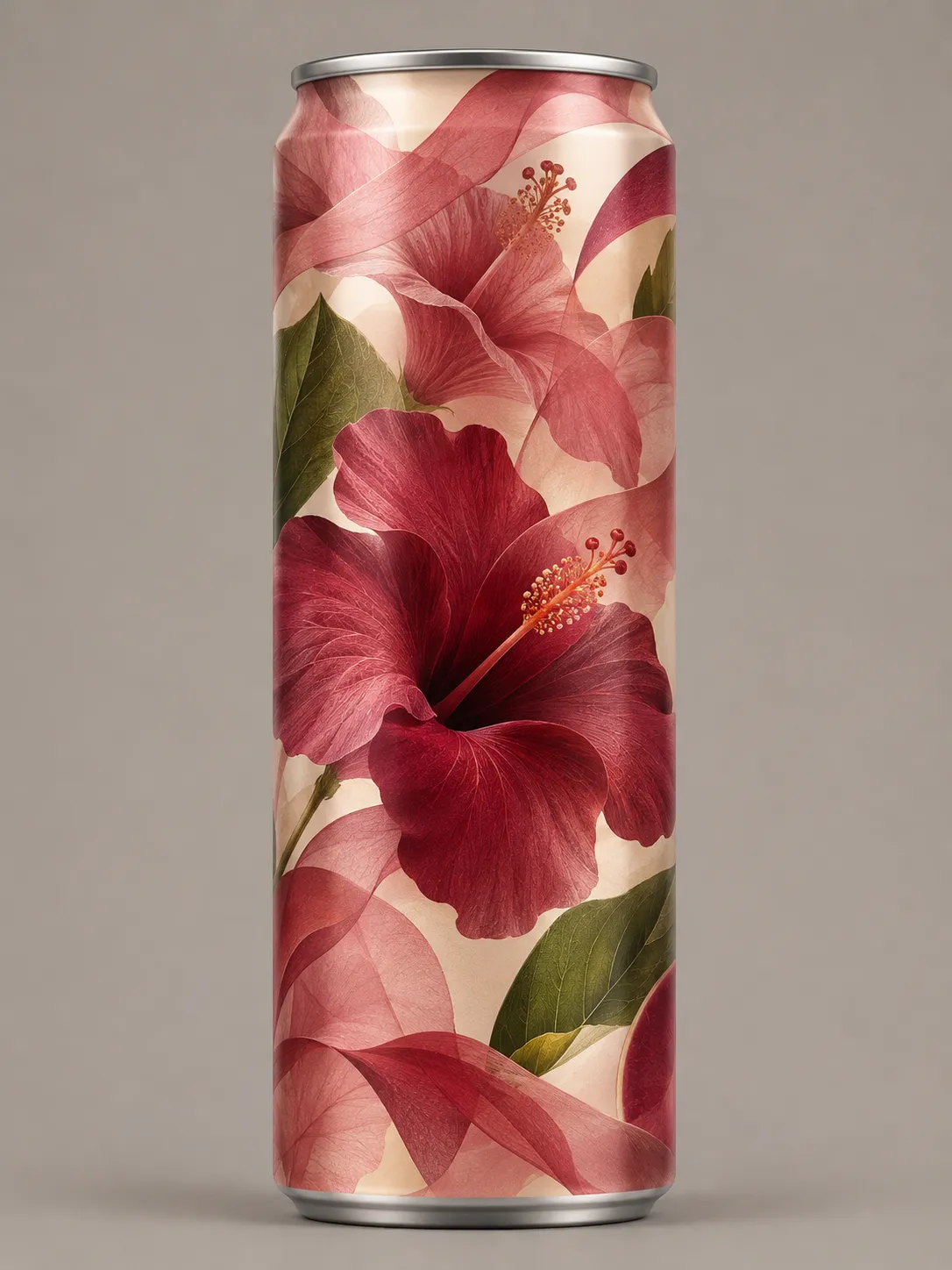
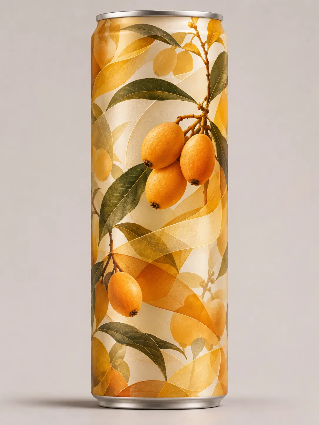
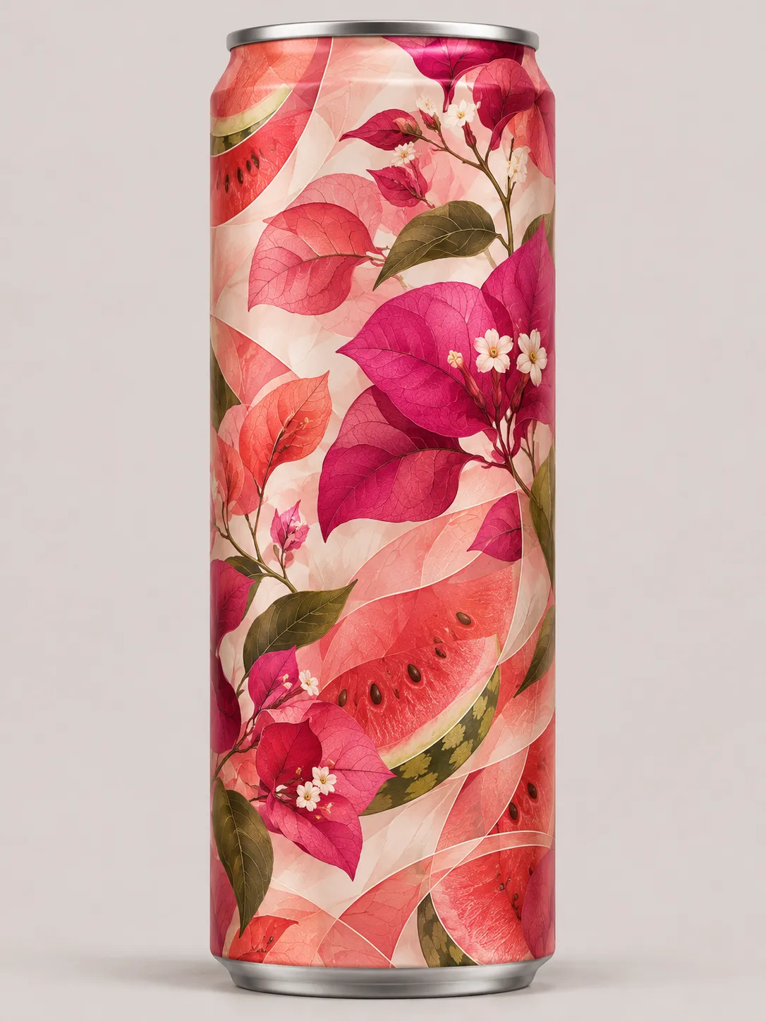
Flavour 3 of 5
Hibiscus, White Tea, Rose and Custard Apple
- Opens
- Hibiscus and rose
- Body
- White tea
- Finish
- Custard apple
The identity · Conceptual demonstration
Shai Script
Contemporary calligraphy with controlled heritage-inspired flourishes.
The name had to feel handwritten, warm and confident without becoming hard to read on a shelf. The lettering began as calligraphy and was then tightened, letter by letter, until it could hold its shape on a slim can.
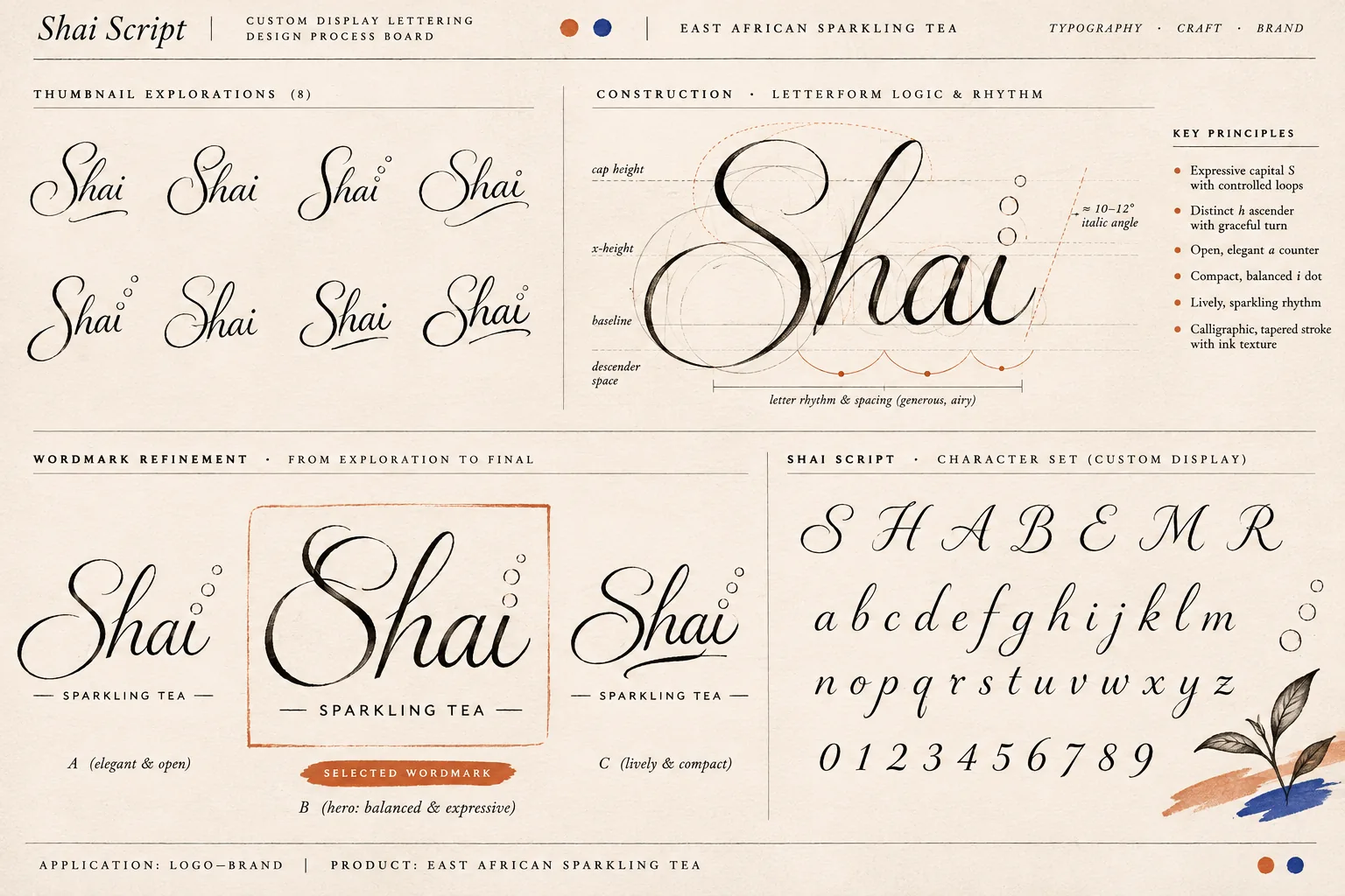
- 01The capital S
An oversized S with controlled loops carries the personality, so the lowercase letters can stay calm. - 02The h into the a
The h rises with a tall ascender and turns down into the a, so the two letters read as one movement. - 03Fluid but legible
An open a counter, a steady italic angle of roughly 10 to 12 degrees and generous spacing keep the word readable at a glance. - 04The i and its dot
The dot of the i lifts into small rising circles. It becomes the bubble motif used across packaging and campaign. - 05Behaviour at scale
At display size the tapered, inked stroke shows. At small sizes the thin hairlines would need thickening, which is a production task still to do.
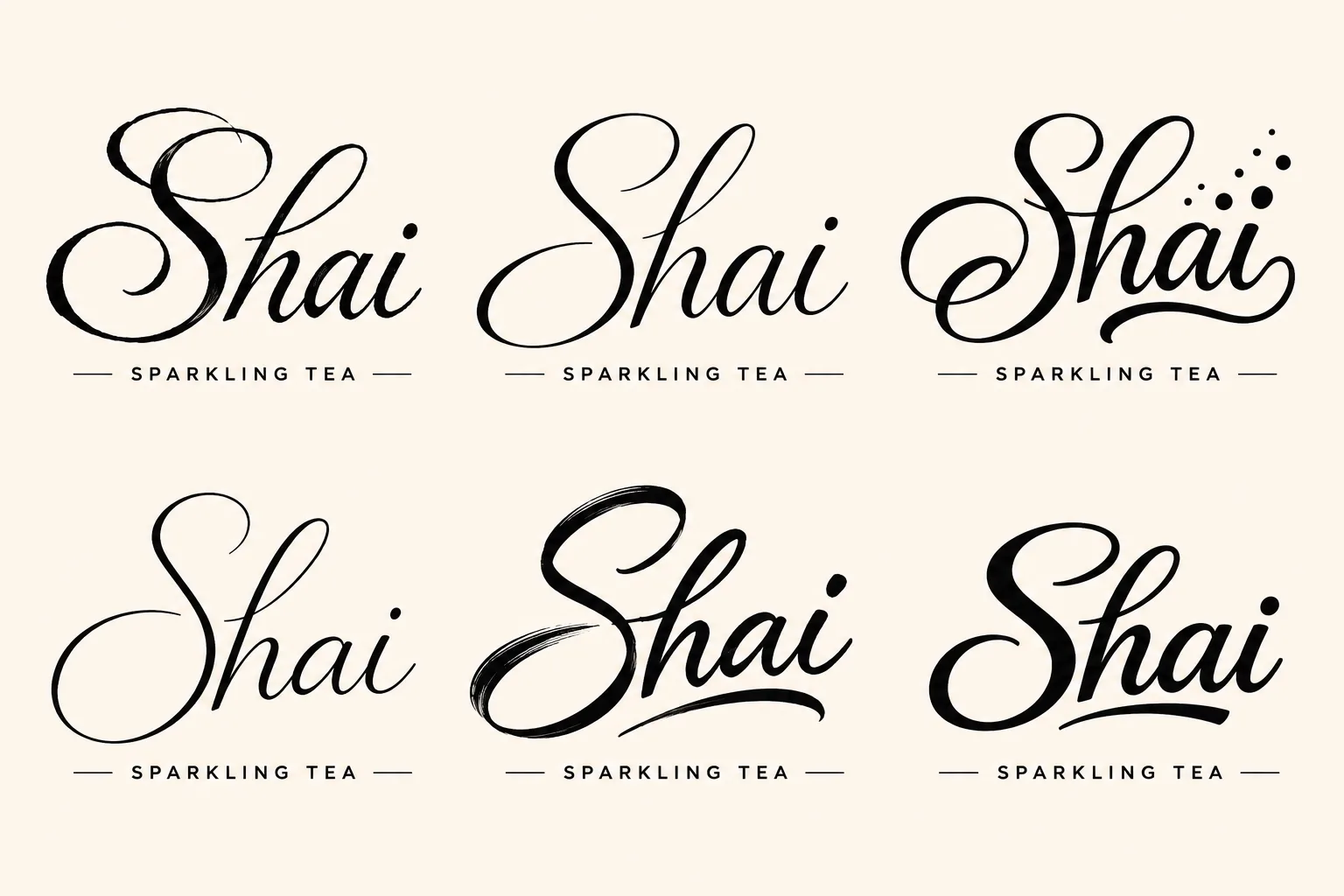
Shai Script is a lettering concept, not an installable font. The board shows a draft lowercase alphabet, numerals and a few capitals. Turning it into a usable typeface would need vector glyphs, spacing, kerning, font compilation and technical testing. A plain, legible typeface handles ingredients, regulatory text and charts.
Packaging
The wordmark on the can
Two ways of placing Shai Script on the same five cans. Running the name up the can makes the brand recognisable from across a room; a small signature lets the botanical artwork lead.
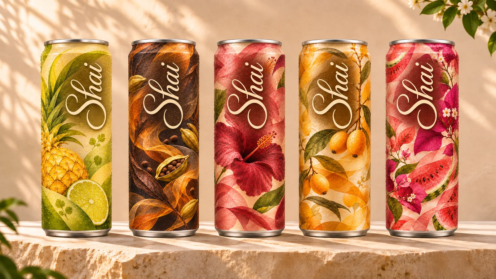
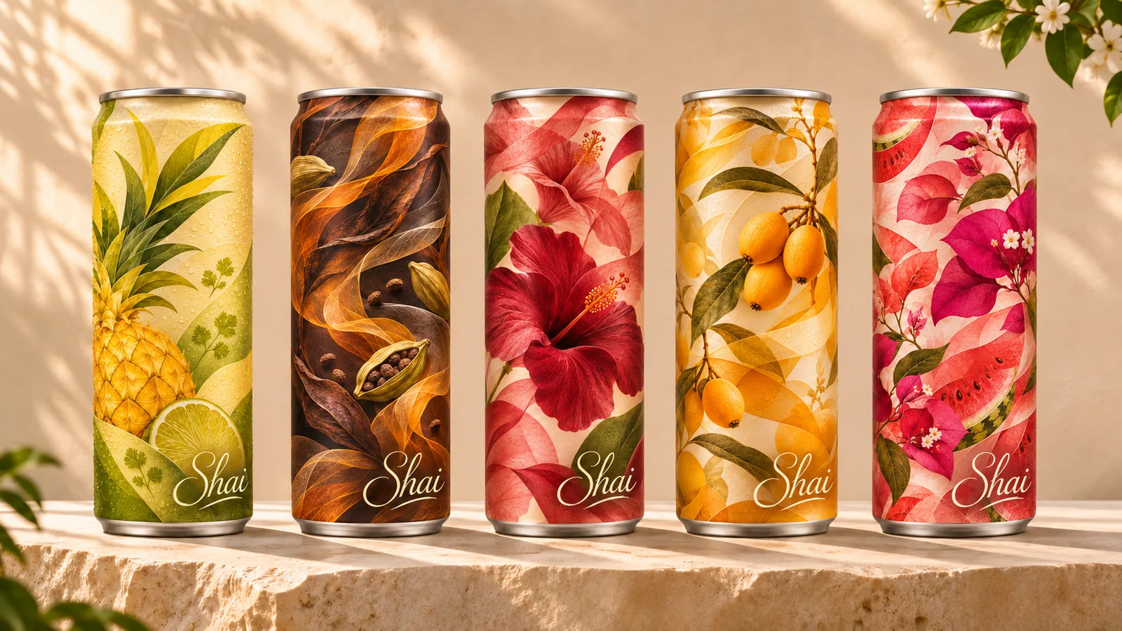
Concept renders, not photographs of manufactured cans. Ingredient, nutrition and regulatory panels are not shown because none have been developed.
The brand world · Fictional brand
The House of Shai
Tea escapes the teacup.
A fictional brand world in five connected spaces. Each one takes tea somewhere unexpected, and each gives the brand a source of content, events and collaborations.


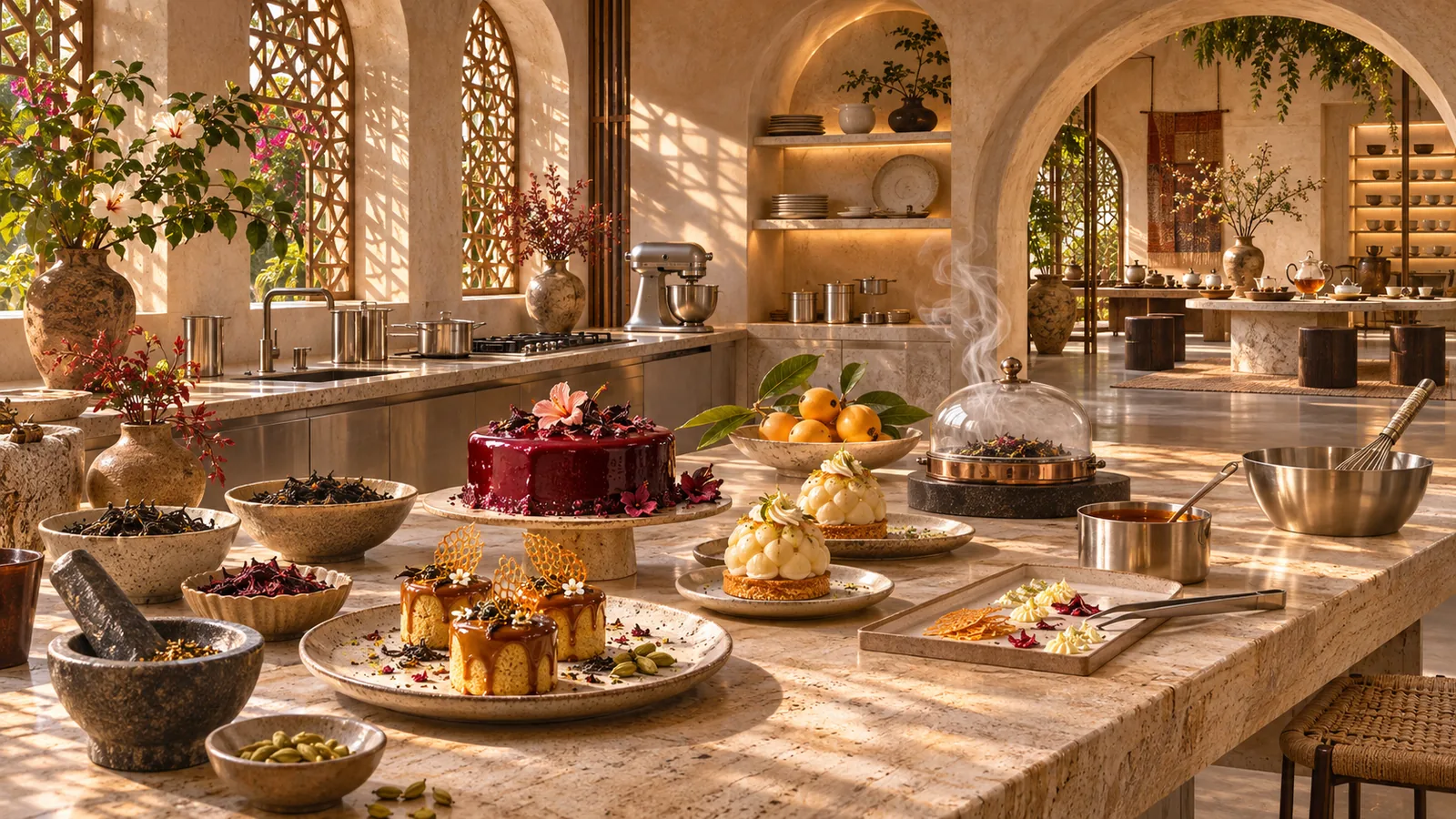
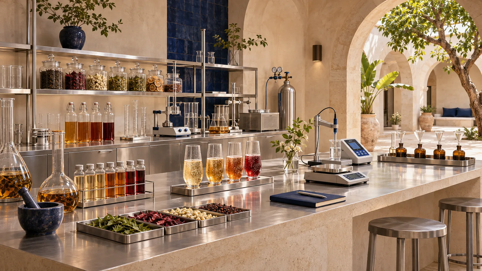

The Tea House
A calm meeting place in limestone and warm plaster where the five flavours are tasted side by side. It is where people meet the product first.
A fictional environment shown in generated concept images. No venue, event or partnership exists.
Five chapters
- 01Origin and market opportunity
Why an East African sparkling tea, and where it would sit. - 02Brand identity and packaging
The Shai name, the Shai Script lettering, botanical illustration and the slim can. - 03Flavour architecture
Five combinations and how each is built. - 04Marketing and campaign development
Art direction, photography and content. - 05Commercialisation and business planning
Costing, pricing, distribution and an illustrative route to market.
All five flavours are hypothetical concepts. Any botanical ingredient in a real product would need a professional food-safety and regulatory assessment for its target market.
Status
The flavour selector, the Shai Script lettering, the wordmark on the can and the House of Shai are in place. Rotating 3D cans are the next step; they need flat label artwork for each flavour.
Concept imagery
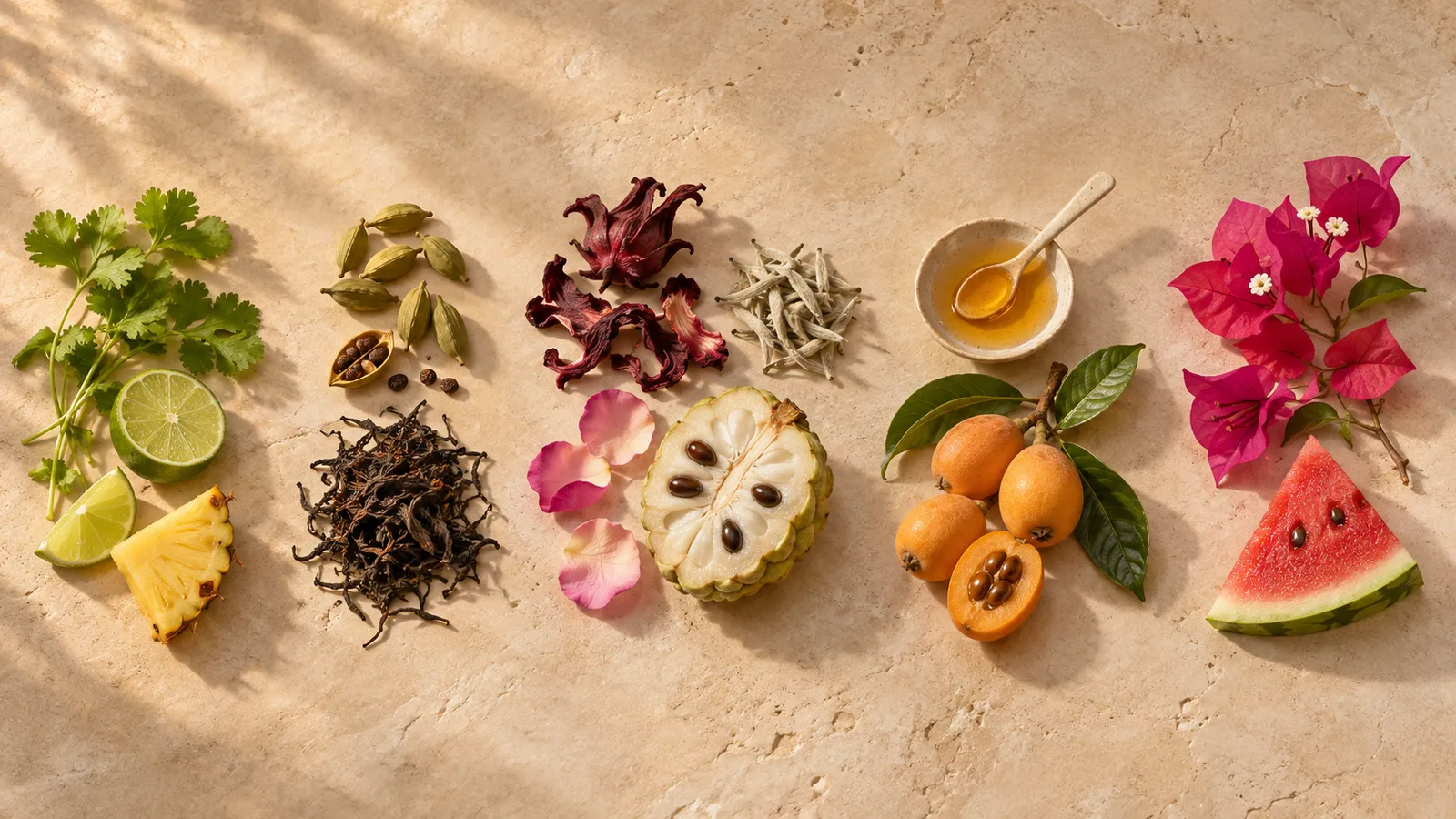
Images are generated concept visuals made for this portfolio. They do not show manufactured products or real premises.
Have an idea that needs to become a product, a brand or a working operation?
Tell me what you are building and where it is stuck. I take on consultancy projects, contract work and part-time roles.